Labor Force Participation and Unemployment are Tricky. Employment is What Matters.

An earlier version of this piece erroneously attributed this to the wrong author. The author is Preston Mui.
Last Friday, we learned that the unemployment rate in August 2023 increased to 3.8% to 3.5%. The employment-to-population ratio was flat at 60.4%, and labor force participation increased to 62.8% from 62.6%. As the White House Council for Economic Advisors points out, the increase in the unemployment rate is almost entirely accounted for by the increase in labor force participation, not a fall in employment rates. Some have referred to this as a “good” reason for unemployment to rise, as it points to a strong labor market bringing in more participants.
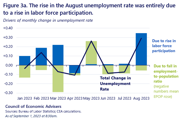
However, the details of labor market entry and exit reveal a more complex story. The increase in participation was not driven by an increase in labor force entries, but rather a decline in labor force exits. And more generally, an increase in unemployed labor force entrants is not necessarily an indication of a strong labor market. Paying attention to the details shows how difficult it is to interpret changes in unemployment and participation, due to the fuzzy distinction between unemployment and non-participation. Ultimately, if you want to pay attention to one indicator, just look at employment.
How many people entered the labor force?
One common interpretation of changes in the labor force participation rate is that the change is the number of people that entered or left the labor force. The CEA, for example, wrote that “over 700,000 entered the labor force” in August, presumably referencing the change in the civilian labor force level between July and August.
The labor market is far more dynamic than implied by the changes in the levels of employment, unemployment, and participation. In August, approximately 6.5 million people entered the labor force, almost ten times the cited increase in the stock of the labor force. In the same month, 5.9 million people left the labor force, leading to a net increase in the labor force.
Flows (Thousands) | June to July 2023 | July to Aug. 2023 | Difference July v. Aug. |
Labor Force Entry | 6,473 | 6,509 | 36 |
To Unemployment | 1,673 | 1,772 | 99 |
To Employment | 4,800 | 4,737 | -63 |
Labor Force Exit | 6,238 | 5,851 | -387 |
From Unemployment | 1,367 | 1,292 | -75 |
From Employment | 4,871 | 4,559 | -312 |
The number of people who entered the labor force in August is actually similar to the number of people that entered in July. The biggest difference is that fewer people, especially employed people, left the labor force in August than in July. High labor force participation is as much about keeping already-existing participants in the labor force as it is bringing in new participants.
On the other hand, more employed people became unemployed and fewer unemployed people became employed in August than in July. The net result is a flat employment rate with an increasing unemployment rate and labor force participation rate. While it is good that people don’t seem to be losing employment at a faster rate, the decline in job-finding (by both the unemployed or those out of the labor force) points to a slowdown in the labor market.
Are there “good” reasons for unemployment to rise?
When the unemployment rate increases alongside an increase in the participation rate, it is often referred to as a “good reason” for the unemployment rate to rise. While this is preferable to an unemployment rate increase that happens because of a fall in employment, I think the characterization of unemployed labor market entrants as a sign of a healthy labor market is too optimistic.
The number of unemployed that are labor market entrants—both new entrants and re-entrants—actually increases during recessions and falls during expansions. At first glance, this is counterintuitive. Aren’t strong labor markets supposed to bring more people into the labor force?

To understand this phenomenon, it’s important to keep in mind that there are actually more labor market entries into employment than into unemployment. One reason for this is that some people find jobs without a period of search that might be recorded as unemployment. The other reason is that the current population survey is a monthly survey, and some people may be out of the labor force, search for employment, and find employment within the month between surveys.
When labor demand is strong, we actually observe fewer unemployed labor market entrants, because more labor market entrants go straight to employment or find employment quickly enough that they are never recorded as unemployed. The result is that labor market entry is manifested through higher employment rates rather than unemployment. Conversely, when labor demand is weak, flows from out of the labor force to employment fall, and flows into unemployment increase.
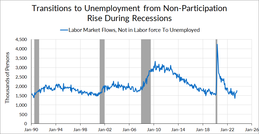
In short, unemployed labor market entrants are not necessarily indicative of strong labor demand bringing in workers from the sidelines. If labor demand were truly strong, many of those workers would be making transitions to employment, not unemployment.
To be clear, I am not saying that the data in August is indicative of a labor market that is deteriorating or pointing towards a recession. It’s just one month of data, and the finer cuts of the household survey can be noisy at this frequency. Even if some labor market indicators have been trending towards a softer labor market in recent months, in historical context these numbers are not too far from their 2019 levels. And historically speaking, recessions don’t happen at the same time that labor force participation rises.
Employment is What Matters
In addition to the aforementioned nuances, unemployment and participation data are muddied by the fact that there is not a neat distinction between unemployment and non-participation. That is why we prefer centering employment rates, in particular prime-age employment rates, as the single best measure of the health of the labor market, if you had to use one stock measure of the labor market.
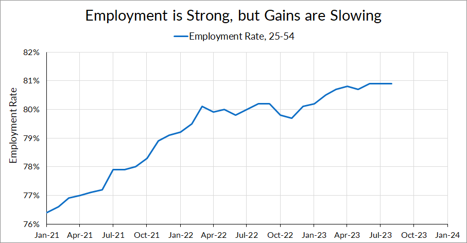
The employment rate data tells us a very clear picture of the labor market’s progress over the past few months. The prime-age employment increased rapidly during the recovery, but has slowed down and has been flat for three months. While employment rates are still high, the pace of increase has slowed down. The labor market is clearly slowing—but still strong.