Labor Market Recap May 2024: Still Cool
The totality of the evidence points more towards a cooling (but still good!) labor market than heating up, despite the payroll prints.

The totality of the evidence points more towards a cooling (but still good!) labor market than heating up, despite the payroll prints.
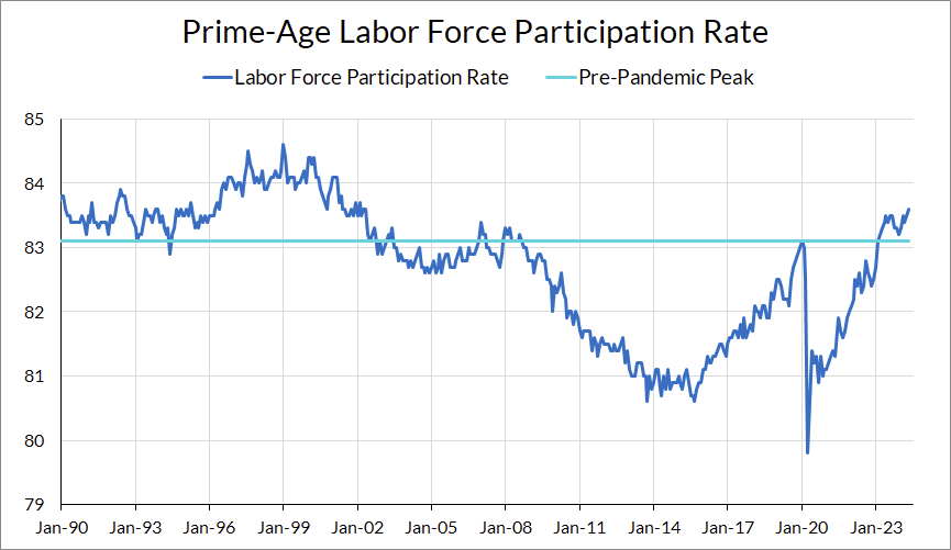
The labor market added 272,000 net jobs in May, with minor revisions to March and April, above expectations. The headline unemployment rate increased slightly by 0.1% to 4.0%. Prime-age employment rates stayed at 80.8%, just off its post-2020 high. Prime-age employment for women hit a new high at 75.7%, and prime-age labor force participation grew to 83.6%, its highest level since 2001. After a soft average hourly earnings print last month, this month saw average hourly earnings grow at 4.9% annualized, with production workers’ earnings growing at 5.8% annualized. The big news in JOLTS comes from the least useful component: job openings fell. The vacancy-to-unemployment rate, an often-cited statistic by FOMC members, is now in pre-2020 territory.
The 4-handle on the unemployment rate notwithstanding, the labor market data from this month is a continuation of the narrative we’ve been on for months: the labor market is strong, but softening.
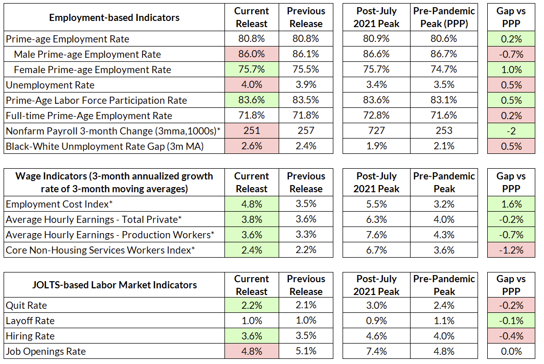
After 26 months in the 3’s, the unemployment rate finally rose to 4.0% for the first time since January 2022. The Sahm indicator currently stands at 0.37, not too far off the 0.5 warning level. On its face, the unemployment rate seems worrying, but the details are more reassuring. The prime-age employment rate, our favored measure of the labor market, is still high and has increased during the past half-year, despite the increase in the unemployment rate.
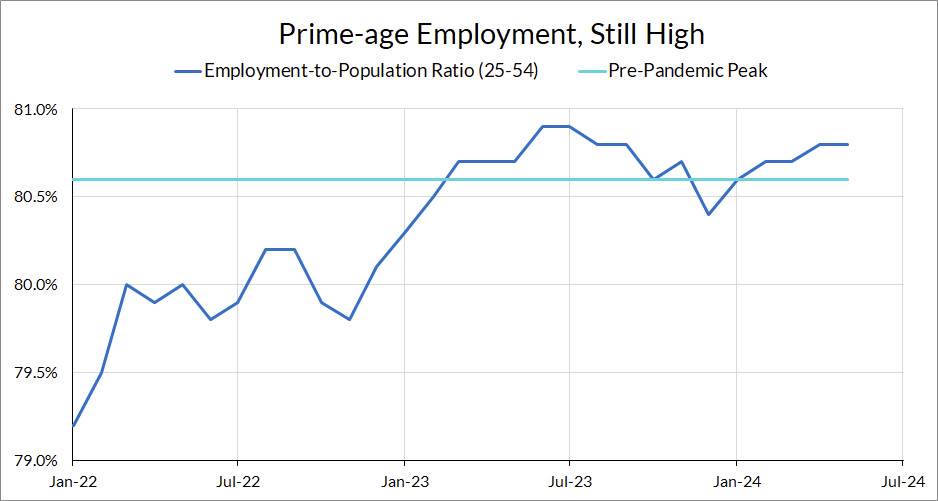
This points to a deterioration in employment outcomes for non-prime-age workers. This month, that deterioration came from the 16-24 age group. The unemployment level rose by 157,000 in May; the number of unemployed in the 16-24 age group rose by 205,000. In May, the youth unemployment rate rose a full percentage point. Over the past year, the youth unemployment rate is up over 1.5 percentage points (but remains by historical standards; even at 9% the youth unemployment rate is at 2019 levels).
Looking at the flows data this month, the unemployment rate increase appears to be driven primarily by an increase in flows from not in the labor force to unemployed (+312,000) and employed to out of the labor force (+487,000). As Ernie Tedeschi points out, the CPS reference week was relatively late this week and more likely to capture young workers leaving school and looking for a job. To add to that, it could also capture college students working leaving their campus jobs.
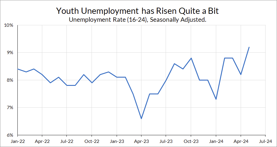
Turning back to prime-age workers, May saw a decent increase in the prime-age employment rate for women, up to 75.5%. This represents a new all-time high for women’s prime-age employment rates. Relative to pre-pandemic peaks, men’s prime-age employment is down 0.7pp and women’s prime-age employment is up 1.0pp.
Meanwhile, labor force participation grew to its highest level since 2001:
The fact that women’s employment and participation has continued to expand is especially welcome news after the concern over the “child care cliff” last year. The expansion of childcare support was credited with the increase in women’s employment early on in the recovery, and there was concern that the end of federal support for childcare could portend a steep drop in women’s participation and employment. Those fears have not been realized, partly some states have stepped up to provide support after federal funding ended, but also partly because labor demand is simply strong enough to keep women in the labor force even with lower childcare support. The employment rate for women aged 25-34 is up 0.3 percentage points over the past year.
Another data point in favor of May’s increase in unemployment as benign: the number of permanent job losers was essentially flat this month. The bulk of the unemployment increase came from reentrants and new entrants. While this figure has increased steadily over the past few years, it remains at historical lows.

Back on My Beveridge Curve
For once, I’m going to talk about job openings. The big news in JOLTS this months as that the nonfarm job openings rate fell again from 5.0% to 4.8%, its level in late-2019. The vacancy-to-unemployment ratio is now 1.24, just under its level in May 2019. We've officially landed on the pre-pandemic Beveridge Curve.
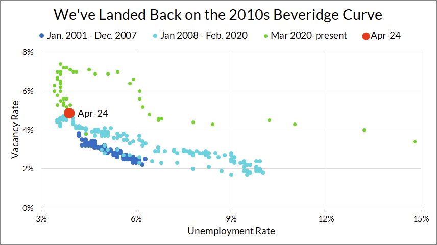
While we have long been skeptical about the value of job openings, FOMC members care about it. With job openings now back to 2019 levels, all of the labor turnover statistics are at or looser than pre-pandemic.
For those who interpreted the labor market through the lens of job openings and the Beveridge Curve, the key question was whether or not job openings could come down without a large increase in unemployment. This depended on one’s views on how much the Beveridge curve would shift back, and the shape of the Beveridge curve. Some, like Blanchard, Domash and Summers (2022), believed that matching efficiency had fallen (i.e. the curve would remain out-shifted); others, like Figura and Waller (2022) argued that a rebound in matching efficiency and a highly convex Beveridge Curve meant that the trade-off was low.

The actual movements of job openings and unemployment have been even more benign than the best-case scenarios of the optimistic side of that debate. The movement in the V-U space has been almost straight down. It’s not clear to me that we’ve been moving along a Beveridge Curve at all. In any case, fears of “matching efficiency” becoming secularly worse after the pandemic appear to have been overblown (and frankly were not predicated on much more than observing high levels of job openings to unemployed).
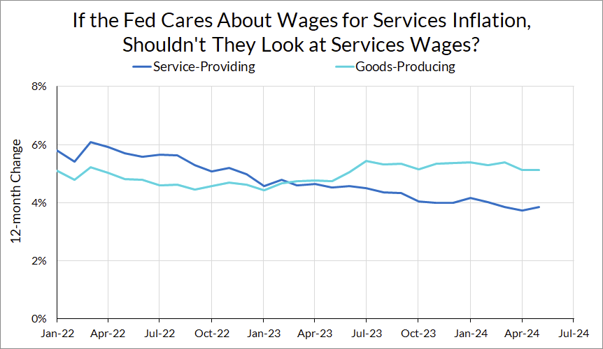
Services Wages Are On the Decline
The Fed will certainly be concerned by the beat in wage growth this month. But zooming out and even doing a little bit of disaggregation, is their concern overblown, given their theory of why wages matter? Multiple fed officials (premium donors can refer to comments by Kugler, Schmid and Collins in our Fedspeak Archive) have argued that wages hold the key to services disinflation, and so they’re looking for wage growth to slow.
And it turns out wages have indeed slowed. You can refer to the index of core non-housing services wages that we maintain (which shows core non-housing services at 3.5% year-on-year) or even just disaggregate average hourly earnings growth by services and goods-producing industries. While the growth rate of wages in services industries was faster earlier on in the recovery, that has since switched. Services wage growth is now under 4%, but wage growth in goods-producing industries has actually accelerated. Since most workers are in services-providing industries, the trajectory of overall wages is still downwards; the part of wages the Fed claims to care about has declined by even more.
Cooling? Or Red-Hot?
A lot has been made of the difference between the household survey and the establishment survey. If one looks at the household survey, the story is of a labor market that is strong in terms of levels, but progress is slowing (or even stagnant, depending on the time frame and measure). If one looks at payroll gains, the labor market looks red-hot.
The debate over which survey to trust mainly focuses on the discrepancy between the employment counts in the two surveys. The household survey has shown persistently lower employment counts than the establishment survey. A number of theories have arisen to try to explain the difference, such as poor modeling of birth-death rates in the establishment survey or underweighting of immigrants in the household survey.
For the question of “how hot is the labor market,” this discrepancy is a little besides the point. As Jason Furman points out in a very clarifying thread, the pace of job growth alone does not tell us if the labor market is tight or not. What matters is whether or not we’re adding enough jobs to keep the labor market at its current level of tightness. The fact that the unemployment rate has steadily increased in recent months is a sign that we are not, and that the labor market is cooling.
Put differently, the primary argument for why the household survey gets employment wrong is undercounting immigrants, which is an argument that the household survey has the population base wrong. But for measures like the unemployment rate, prime-age employment rates, and labor force participation, this is less of a problem. Even if immigrants are underweighted in the household survey, you can still think of the reported unemployment rate as a crudely demographically-adjusted measure of the real unemployment rate (adjusted to the pre-immigration surge trend).
A red-hot labor market is also inconsistent with the other data points we have. It’s hard to conclude that the labor market is red-hot when the number of unemployed job losers is on the rise (a household survey measure that ought to be underestimated if immigrants are underestimated), a steady fall in hiring and quit rates, and lower wage growth. The totality of the evidence points more towards a cooling (but still good!) labor market than heating up, despite the payroll prints.